


Minnesota State Flag
$40.00
30-day returns · Guaranteed since 2003
Minnesota changed its flag in 2024. It didn't go over well. While many including myself were not fans of the old Minnesota state flag because it was just another flag that slapped the state seal onto a blue field like so many others, at least it had the lukewarm approval of the public.
I've probably redesigned the Minnesota state flag a dozen times myself. Lots of vexillophiles will agree that those state seal flags are all wrong and break all the rules of good flag design. But you know how people are with civic symbols. If it ain't broke, don't fix it.
The new flag, though, was a train wreck. You see, Minnesota is not what most folks imagine it is. It's culturally split. Most people see Minnesota as being the Twin Cities. A frozen hellscape of unreasonable hyper-progressives that sparked the nationwide George Floyd riots and followed up with ICE protests and Somalian immigrants that have turned the North Star State into the nexus of civil service fraud.
It is that. But if you drive a few miles out of the metro area it immediately turns into the epitome of hardworking, independent, and even staunchly conservative-but-proudly tolerant cities and towns and rural hamlets dotting the landscape of lakes and forests.
They were fine with the flag. Maybe even flew it. They didn't really much think about it, actually. But then Governor Tim Walz approved the new flag that was the product of a yearlong design contest, and he did it during an election year. And an election year where he was the Vice-Presidential candidate for Kamala Harris. And while news was breaking about massive Somalian fraud rings throughout the state. Heck, a huge autism services fraud case was right up the street from me.
And people immediately noticed that the new flag looked a little too similar to the flag of failed state of Somalia. As we say here in Minnesota, oofda.
The flag began to represent the metro political machine and Tim Walz, who seems to be enmeshed with the fraud allegations and who by 2025 announced that he wasn't going to be running again for governor. It was bad.
And so now Minnesotans are dusting off their old Minnesota flags and putting them up, just as Metro Minnesotans are digging in and making the new flag their symbol of their North Star left utopia.
As an old designer, I know two things:
1. If the people want the old flag, they should have the old flag.
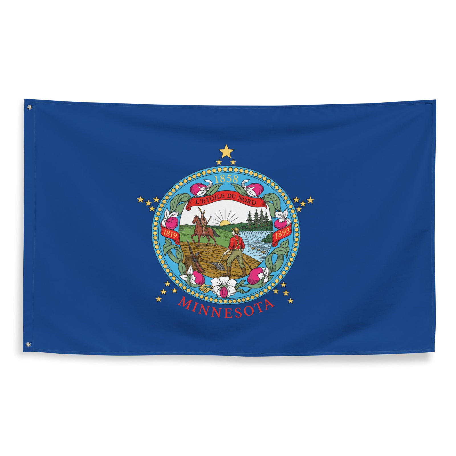
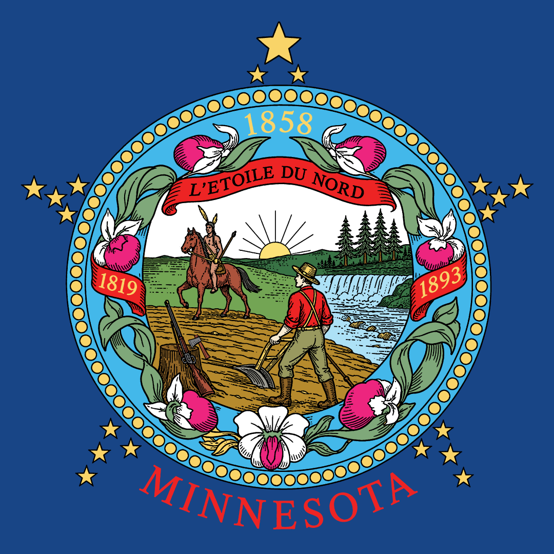
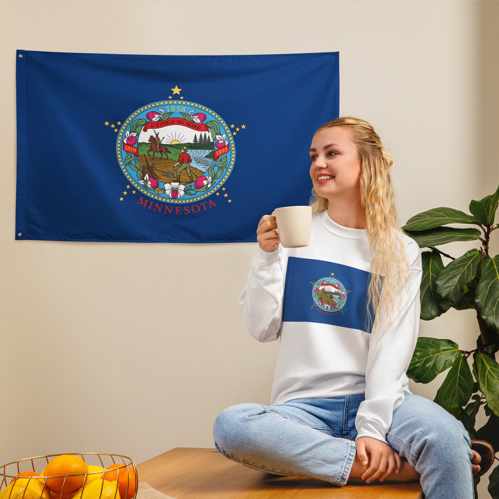
2. The old flag was awful. The Seal illustration just looked like abstract blobs because nobody properly illustrated the scene as if they really cared for their state.
So, I decided to fix it. I'll keep the old seal composition, make it accurate to the intent of the original, but I'm improving it so that everyone can see what each thing is. The man and the plow, the rifle, the axe, the Indian riding West across the man's developed land into the sunset.
It's all there, just like the poem Mary Henderson Eastman wrote to accompany her husband's flag design in 1849.
“Give way, give way, young warrior,
Thou and thy steed give way;
Rest not, though lingers on the hills
The red sun’s parting ray.
The rock bluff and prairie land
The white man claims them now,
The symbols of his course are here,
The rifle, axe, and plough.”
The originals were painted onto Civil War battle flags at Gettysburg. And other depictions continued will elegant illustrations. But by the 1950s the flag became a mess. Then in 1983 instead of fixing the mess, they leaned into it and made it even worse.
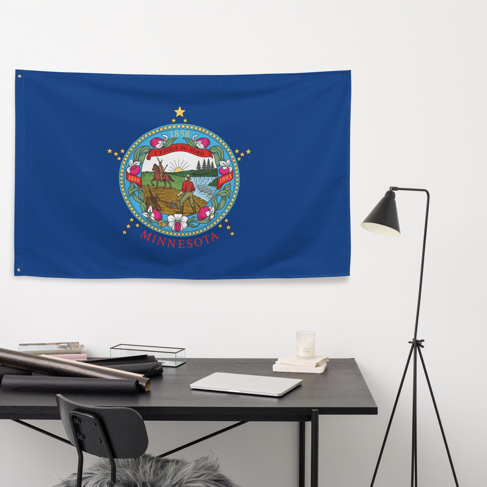
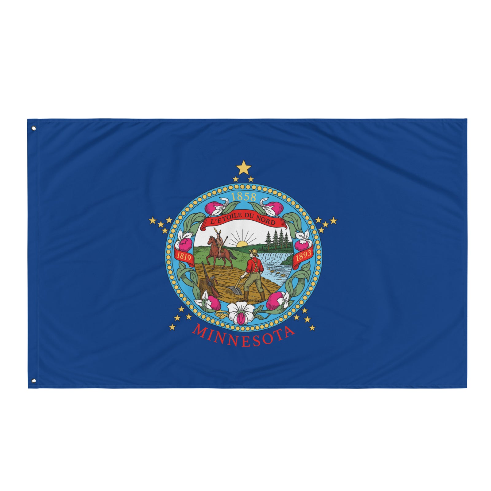
It is what it is. It's not the flag I would design. But it's not my flag. It's our flag. So, I present to you, the 2026 Minnesota flag as a celebration of America's 250th birthday.
• 100% polyester
• Knitted fabric
• Fabric weight: 4.42 oz/yd² (150 g/m²)
• Print on one side
• Blank reverse side
• 2 iron grommets
• Made in the USA
Size guide
| LENGTH (inches) | WIDTH (inches) | |
| One size | 34 ½ | 56 |
| LENGTH (cm) | WIDTH (cm) | |
| One size | 87.6 | 142.2 |
🛡️ Since 2003, we've stood behind every order. Something's off? We make it right.
You may also like
Shop with your confidence and conscience Intact